

LOGO Usage Guidelines
1. Standard Colors
Standard colors are one of the important factors in constituting the spirit and brand culture of the Institute. They create a strong impression through visual communication and achieve the recognition function of colors in visual communication.
CMYK
Red: 20/100/100/0
Blue: 100/60/0/60
RGB
Red: 200/22/30
Blue: 0/43/96
PANTONE
Red: PANTONE P49-8C
Blue: PANTONE P108-16C
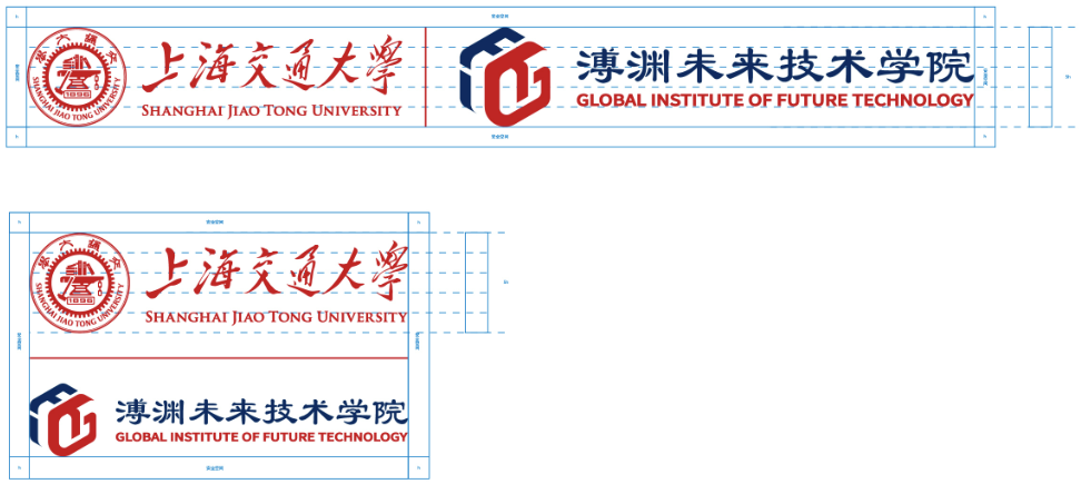
2. Clear Space
To ensure the logo is recognizable and not confused with other design elements in the process of dissemination, the logo is spatially isolated and a safety space around it is defined. Other design elements, such as graphics, text, or symbols, are prohibited from intruding into the safety space, except in cases of specific needs.
As the safety space range of the logo, the gray part is the safety space range of the logo using 1/5 of the logo height h.
For general needs, the logo file provided by the university and the institute should be used.
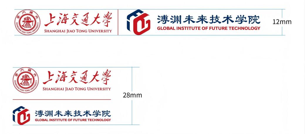
3. Minimum Size
To avoid logo producing an adverse blurry effect when in use and ensure the clear and effective dissemination of visual image, the minimum usage dimensions under different color versions are specially stipulated.
Logos cannot be smaller than 36 pixels on electronic media.
4. Common Mistakes to Avoid
1) Logos must not be altered in any way (color, font, horizontal/vertical ratio, slant, etc.).
2) You must not use any part of the logo as a part of another logo or change the logo in any way (colors, fonts, vertical/horizontal ratio, slant, etc.).
3) You must not redraw, smear, distort, invert or change the proportions of the logo.
4) You must not add text or graphics to the logo.
5) You must not change the proportionality of the elements in the logo.
Download the attachment
Copyright © 2021 Global Institute of Future Technology, Shanghai Jiao Tong University , Technical support: ALA